Showing posts with label book covers. Show all posts

Wednesday, August 8, 2012

E-Book Jackets that Age Like Print Books

Last weekend, I finally purchased an iPad. While I got it for freelancing purposes and will most definitely be claiming it as a work expense on my taxes, I must admit that I've been having fun playing Fruit Ninja on it. I have yet, however, to read a book on it, though I am sure I will get there. 

Naturally, after my big purchase, I also bought a nice little case for it. Leather and purple with a nice little stand thingy attached, I was quite pleased with my choice. Until I saw this link to an InsideHook article on Ed Burn's Twitter this morning (yes, that's right. Ed Burns):

What eReaders lack in personality, they make up for in convenience — like, isn't it convenient nobody can tell you're tittering over 50 Shades of Grey? Unless you’re in a gimp suit. Can’t help you there.
Stay incognito while staying classy with Out of Print’s newly-launched “E-Book Jackets”, just funded on Kickstarter.
Built by America’s oldest bookbinder and designed by MIT eggheads, Out of Print’s tough-as-nails jackets are gorgeous replicas of the original book covers of last century’s definitive tomes — from the art deco eyes of Fitzgerald’s Great Gatsby, to the titular white whale of Melville’s Moby Dick to the temptress of Nabokov’s Lolita. 
The jackets are designed for the iPad, Kindle Fire, or Nexus 7, and the interior cradle fits the exact contours of the device, allowing you to easily access all important ports and buttons.
And just like a true hardcover, the jackets will artfully weather over time the way a good book should.
Simply pre-order on Kickstarter, and you’ll receive an email requesting your choice of cover. Come September, your eReader’s new outfit will arrive in the mail.
However, you’ll still need a good alibi when asked “so, whatcha readin, gimp?”
See the original post HERE
Then I headed on over to Out of Print Clothing's website (one I wrote a piece on not too far back, in fact) to check out their shop. More awesomeness abounded:
Made by the oldest bookbinder in the U.S., our cases are the first to look, feel and wear like an actual book. Each hardcover case features original book cover art, printed on book fabric that has been treated to withstand daily wear and tear. Because it is made like a book, it will look better the more you use it.

Le sigh. How cool!

Wednesday, August 1, 2012

Bathing Suits That Match Book Covers? Yes, Please!

This summer I have only gone to the beach once. It's sad, really, as going to the beach is glorious, especially when it's as hot out as it's been here in New York. The cold Atlantic can be shockingly refreshing.

I do have one more day trip planned this summer, thank goodness, but I wish I had more. And if I owned an amazing bathing suit that matches a book cover like these folks (courtesy of Matchbook.nu) , I would MAKE IT HAPPEN:


The book: I Was Told There’d be Cake by Sloane Crosley
The first sentence: “As most New Yorkers have done, I have given serious and generous thought to the state of my apartment should I be killed during the day.”
The cover designer: Ben Gibson. 

 
The book: Slaughterhouse Five by Kurt Vonnegut
The first sentence: “All this happened, more or less.”
The cover designer: Carin Goldberg
The bikini: Kudeta Bikini. $45.


The book: The Life of Pi by Yann Martel 
The first sentence: “My suffering left me sad and gloomy.” 
The bathing suit: Men’s Swimming Trunks by EUROPANN. $49.


The book: And Then There Were None by Agatha Christie
The first sentence: “In the corner of the first class smoking carriage, Mr. Justice Wargrave, lately retired from the bench, puffed at a cigar and ran an interested eye through the political news in The Times.” 
The bikini: Colorblock Zipper Bandeau by Tavik at Free People. Top for $39.95.


The book: The Last Hundred Days by Patrick McGuinness 
The first sentence: “In 1980s Romania, boredom was a state of extremity.” 
The bathing suit: Tea Rose One Piece Bandeau by Juicy Couture. $173.


The book: Living Dead in Dallas by Charlaine Harris. 
The first sentence: “Andy Bellefleur was drunk as a skunk.” 
The bathing suit: Space Print Swimshorts by River Island from ASOS. $41.43.


The book: The Pesthouse by Jim Crace 
The first sentence: “Everybody died at night.” 
The cover designer: Helen Yentus 
The bathing suit: Swimsuit with Bird Print by Salinas available at ASOS. $130.07

See more bathing suits matching book covers HERE

Friday, February 10, 2012

Guest Blogger, Allison Pang: Cover Me

Don’t judge a book by its cover.

We hear that all the time, but the truth of it is that covers *do* matter. Like it or not, many readers often use covers to determine the “quality” of a book, even if what’s on the outside isn’t indicative of the inside. I know when I browse bookstores, my eye is usually drawn to particular types of covers, and on a shelf with hundreds of potential stories, I’m going to go to the ones that attract my attention first.

Not that it’s always a match.

I’m sure we’ve all found books with fabulous covers that were dogs inside…and discovered gems with lousy covers. Given the sheer number of books and eBooks out there, I do think that we tend to gauge the professionalism of a book by the care given to the outer shell.

This is probably particularly true in the self-published realm. You see a lot of advice given about editing, but it’s also fairly common to see requests to not skimp on the cover.

So what makes a good cover? What makes a bad cover?

The thing is, with some obvious exceptions, it’s hard to really tell. What one person finds appealing, another may not. What publishers are trying to bank on is finding a cover that will appeal to the largest range of potential buyers.

Which is great – but that’s when we start seeing trends. When I look over my bookshelves, I can almost immediately pick out which fantasy books were from the late 80’s – simply due to the style of the images, and the fact that they’re all done by 2 or 3 artists who were fairly popular back in the day. (Lots of dragons and scantily clad women, of course.) Or bodice ripper romances graced with manly men and women falling out of their clothes? (And random animals in the background and huge swirly fonts proclaiming Scarlet Something, or Heated Whatever.)

Take Urban Fantasy today – how many covers have kick-ass women in leather? Or shirtless men with abs of steel for Paranormal Romance? (and how many covers have we seen lately where it’s not even an entire person? Just an abdomen, glistening in the moonlight?)

And then there’s sometimes a bit of reader backlash. (And sometimes mockery. Just check out WTFbadromancecovers.tumblr.com if you want to see what I mean.)

They want something different, but how can they find that different book when they all start to look the same? And if I had to ask you, what cover have you seen in the last few years that instantly became a trendsetter? That you would recognize on sight?

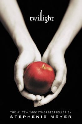
For me, there are very few. Maybe Twilight, which I’ve never read, but the minimalist color scheme and stark background make for immediate recognition. (And a fair number of copycats afterward.)

It becomes a fine line, really. We want readers to know what sort of book they’re picking up because it makes it easier for them to choose what to read – I’d expect something sexy for an erotic romance, for example. But we also want to have them stand on their own. (God, it’s almost like high school, isn’t it? “Be yourself…but don’t be so different that no one will have anything to do with you!”)

So what are your favorite covers? Most hated covers? What is it about a cover that leads you to buy or read a book? Do covers matter at all?


Note about the blogger (from Danielle!): Allison's second novel in her Abby Sinclair series, A Sliver of Shadow, hits shelves Tuesday, February 28th! The sequel to A Brush of Darkness, it's highly recommended! (You can also read the first chapter excerpt HERE.)

Comment on this post for a chance to receive a set of Abby Sinclair novel bookmarks..and a copy of the new release!

The recipient will be picked at random one week from today--Friday, February 17, at 3 p.m.!

Tuesday, September 7, 2010

Why "Must Love Books" loves BOOKS

You all know how I feel about e-books (and if you don't, you'll understand quickly if you check out all my tagged RBtL posts ), how I crave the physicality of the book when reading. I've even been struggling lately reading submissions on my e-reader. Yes, that's right. Word documents are difficult for me to even read on screen. I know, I know. It's very sad.

But I'm not the only one who feels this way, as pathetic as I personally may be about it.

Exhibit A: a new post from one of our guest bloggers, T.S. Ferguson, over at his blog Must Love Books:

For a few months now, my mother has been asking me about e-readers, what kind I would recommend (the Sony or the nook, but I have a personal one-man boycott against Amazon especially with e-books, so I’m biased), whatthey’re like to use, and more specifically, what brand I would want if shewere to get me one. Every time she asked I would tell her the same thing.

“Honestly mom, I don’t really want or need an e-reader. I wouldn’t use it so please don’t waste your money on buying me one. I could use some bookshelves though.”

Well she bought me one anyway (yes I said thank you) and many of the friends that I’ve told seem shocked that I’m not more excited about my new “toy.” They don’t understand why I’m not buying thousands of e-books and taking it everywhere with me. Many of them have told me “just wait…you’ll get used to it and then you’ll be addicted.” But I know I won’t and here’s why.

I love books. I don’t just mean reading. I love physical books. So much of the pleasure I derive from the reading process comes from the actual physical book. Maybe that’s a comfort thing from growing up as a reader, but so be it. Let’s start with the purchase. While it’s nice to be able to order a book offline and have it shipped, there’s no substitute in my mind for going to the brick-and-mortar bookstore and browsing the shelves. Some people find it soothing to shop for clothes, I shop for books. I love scanning the shelves, pulling out books that look interesting, reading the copy, judging books by their covers, and ultimately walking away with at least a few books to buy. If I go looking for a specific book and it’s not there, I will almost always say no when the clerk asks if I’d like to special order it. It gives me an excuse to go to the next closest bookstore and repeat the whole process again.

E-books, being digital, cannot be bought at a bookstore. All you have to do is go online or on your reader and click a few buttons. It sounds easy but to me, that’s boring. And unlike my fashion-loving friends, who can order something and then get to try it on when it arrives, I don’t even get something solid I can hold in my hands.

Once I’ve bought my books, I love to look at the covers and read the copy again. Covers are very important to me. There have been times when a cover will make or break a book for me. In fact, you could probably hand me my favorite book and if it had a horrible cover, I would probably not enjoy the reading experience as much as I would if it had a cover I loved. I could still enjoy the book, but part of the experience wouldbe ruined for me. And unfortunately e-books don’t really come with covers.Even the companies that include their covers in the e-book can’t duplicatesome of their most amazing covers on the grayscale e-readers. I downloaded afree sample of Jennifer Brown’s Hate List (which, you’ll recall, was my first acquisition) just to see what it would look like as an e-book, andwhile the cover was included, even that cover, which was incredibly beautiful, simple and only two-colors (black and gray-blue) just didn’t do it for me on the e-reader....

Read the rest of T.S.'s fantastic post HERE

Wednesday, August 18, 2010

New from Fab Author Starr Ambrose...

AND one more thing!
(Aren't you LUCKY?!)
Another one of my fabulous authors, Starr Ambrose, just started up a new blog--Dirt Road Diaries! It highlights all the ins and outs of life on her farm and is perfect for any animal-lover! You can also check out her author site for more on her super fun books!!


Look for THIEVES LIKE US on 11/30/10!


It's my favorite one yet!
She just keeps getting better and better! :)

I'm alive!!

I know, I know. I've been MIA for way too long.

But I have good reasons!

I swear!

Reason #1: I've been swamped at work, often feeling like this little kitty in the cage, helpless and annoyed haha However, unlike said kitty, I must cl;aw my way out and make magic happen on a daily basis.


Reason #2: My dear friend Marie got married in Ottawa this past Saturday (check out her great blog, De-briefed!), so I went on a bit of a road trip to celebrate with her. I love you all and love writing for you, but it was totally worth it :-p


Reason #3: My guest bloggers are all sleeping. WAKE UP, GUEST BLOGGERS! I NEED YOU!

Now, since I still don't have time to write a full post, unfortunately, I will leave you with a sneak peek at A Brush of Darkness, the first book in Allison Pang's fantastic debut urban fantasy series :)

It's not officially final yet but it's AMAZING and I'm soooo excited! The cover came out fantastic and the book is even better! So proud of my author for doing such an incredible job and can't wait to work on book 2 with her!


Hits shelves 1/25/2011!

Friday, June 25, 2010

Reality TV Tackles a New Brand of Creativity

BravoTV has been in the forefront of reality tv for years with shows like Top Chef, The Real Housewives, America's Next Top Model, Project Runway, and many more.
In fact, just this month--June 9th to be exact--Bravo premiered another inventive series, Work of Art: The Next Great Artist, airing on Wednesdays at 10/9c:
Work of Art: The Next Great Artist will bring together fourteen aspiring artists to compete for a solo show at the prestigious Brooklyn Museum and a generous cash prize.

[…]

In each episode, contestants are faced with the challenge of creating unique pieces in a variety of mediums such as painting, sculpture, photography, collage and industrial design. The weekly assignments are exciting, original and will challenge the artists' to push the limits of their technical skills and creative boundaries. Completed works of art will be appraised by our panel of top art world figures alongside a new celebrated guest judge every week. Through a gallery showing at the end of each challenge, these industry select dictate which artists have successfully mastered the subject matter and creation of their piece, as well as whose concept leaves the greatest impact.

Learn more about the series HERE

Why am I telling you all this, you ask? Well, because this week's episode challenged each contestant to create cover art for a classic novel. The winner was awarded by having their cover featured on a Penguin Classic.

I gotta say, some of these covers are pretty damn cool. Others, however, I don't get AT ALL.

For example:

COOL: Bram Stoker's Dracula by contestant Mark


HUH?: Jane Austen's Pride and Prejudice by contestant Judith


Take a look at the slideshow of the artists' work HERE, and let us know which one's YOUR favorite!

Monday, May 10, 2010

The Ever-changing Book Cover

Several times a month, one of our subsidiary rights managers brings me over a stack of foreign editions to send to an author. While I dread these visits because they usually come with annoying and tedious work I'm always anxious to see what *insert country here* did with the book cover. There's always a striking difference between a U.S. edition and its foreign counterpart. Sometimes the foreign cover is surprisingly compelling, but more often that not, I've found that they're strangely off-putting, literal, and frequently don't even make sense to the naked eye. It's baffling.

In a time when movies and music usually maintain their packaging worldwide, why is it that the book biz breaks convention and redesigns? Some say it's simply a cultural difference, that it's just good business sense for foreign publishers to market their books for their specialized consumers. On the surface level, this makes complete sense. But if it works for other kinds of media to use American art, why are books any different?

Tom Lamont of the Gaurdian.co.uk pondered the very same thing in his post in The Observer yesterday:
[...] "What you are trying to get across on a cover is the essence of a book, quite an ambiguous thing," says Nathan Burton, a British designer who created the striking cover for Ali Smith's The Accidental, based on an image of a dead woman. "Designers in different countries read and interpret the fiction in different ways." It doesn't quite explain how Germany arrived at silhouetted dancers for House of Meetings, but "the germ of an idea can come from anywhere," says Burton. He points to the Swedish cover of The Accidental, on the surface a starkly different treatment – "but there's a photograph of a girl, bold sans serif type... You could argue that they are born out of a similar thought process."

There are colder business reasons for creating jackets that differ by territory, says Julian Humphries, head cover designer at Fourth Estate: "Different sales channels have different sensibilities." It can be hard to pinpoint what exactly these sensibilities are – "It's a cultural thing," he says, "as taste-driven as different countries eating different things for breakfast" – but broadly speaking, literary fiction is an easier sell in mainland Europe than in the UK or the US, so publishers there can be less overt in their attempts to grab the attention of customers. "In Europe you often see book covers with simple images and plain type, and that sells books for them," says Burton, whose colourful design for A Fraction of the Whole by Steve Toltz stands in stark contrast to the black-and-white German edition. "The UK book market is more competitive, all the covers in shops shouting: 'Buy me!' We have to put on a bit of extra spin."

The US, meanwhile, tends to signpost its literary fiction more than the UK, says Humphries. "With their version of Wolf Hall, for instance, they picked out the history bent of the novel much more. Theirs was a great cover, and won prizes everywhere."

Why don't publishers, then, replicate covers that have been a success abroad? "It does happen but it's quite rare," says Humphries. Megan Wilson, an art director at Knopf Doubleday in New York, says that American designers are sometimes asked to look at British jackets, "as an example of something that works or doesn't, but we are rarely asked to use them directly." Burton tries to avoid looking at alternative covers if he's working on a book that's already been published. "It can take you off on odd tangents. It's always best to work from fresh."

Having worked in both the US and the UK, Wilson is sceptical about book buyers being so different in each country that they require different covers. "Why is there a need to design different covers for different countries? I don't believe there is one. When I crossed over to New York publishing after working in the British industry, I didn't change my style at all."

"I don't know whether it comes down to bloody-mindedness to do our own thing," says Andrew Smith, a designer at Penguin, "but it has certainly become the norm to start covers from scratch." Could it be that all this re-jacketing zeal – the Alexander McCall Smith reimagined in France to look like an issue of National Geographic, a British Stieg Larsson designed with all the artistic nous of an NHS pamphlet – comes down to pride? [...]

Read the full article HERE
Lamont and his interviewees make some interesting pointsm but they make no real headway here. The logic behind the redesigns is still a big question mark. Maybe it always will be.

But at least the varied covers can give us a little laugh--and some WTFs--here and there (re: the below UK (and US offshoot) vs. French Everything is Illuminated and US vs. Italian Harry Potter).


and vs.


vs.


Anyone want to guess why Harry's wearing a mouse hat? LOL.