
We hear that all the time, but the truth of it is that covers *do* matter. Like it or not, many readers often use covers to determine the “quality” of a book, even if what’s on the outside isn’t indicative of the inside. I  know when I browse bookstores, my eye is usually drawn to particular types of covers, and on a shelf with hundreds of potential stories, I’m going to go to the ones that attract my attention first.
Not that it’s always a match.
I’m sure we’ve all found books with fabulous covers that were dogs inside…and discovered gems with lousy covers. Given the sheer number of books and eBooks out there, I do think that we tend to gauge the professionalism of a book by the care given to the outer shell.
This is probably particularly true in the self-published realm. You see a lot of advice given about editing, but it’s also fairly common to see requests to not skimp on the cover.
So what makes a good cover? What makes a bad cover?
The thing is, with some obvious exceptions, it’s hard to really tell. What one person finds appealing, another may not. What publishers are trying to bank on is finding a cover that will appeal to the largest range of potential buyers.
Which is great – but that’s when we start seeing trends. When I look over 
Take Urban Fantasy today – how many covers have kick-ass women in leather? Or shirtless men with abs of steel for Paranormal Romance? (and how many covers have we seen lately where it’s not even an entire person? Just an abdomen, glistening in the moonlight?)
And then there’s sometimes a bit of reader backlash. (And sometimes mockery. Just check out WTFbadromancecovers.tumblr.com if you want to see what I mean.)
They want something different, but how can they find that different book when they all start to look the same? And if I had to ask you, what cover have you seen in the last few years that instantly became a trendsetter? That you would recognize on sight?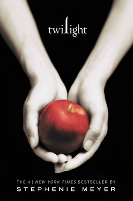
For me, there are very few. Maybe Twilight, which I’ve never read, but the minimalist color scheme and stark background make for immediate recognition. (And a fair number of copycats afterward.)
It becomes a fine line, really. We want readers to know what sort of book they’re picking up because it makes it easier for them to choose what to read – I’d expect something sexy for an erotic romance, for example. But we also want to have them stand on their own. (God, it’s almost like high school, isn’t it? “Be yourself…but don’t be so different that no one will have anything to do with you!”)
So what are your favorite covers? Most hated covers? What is it about a cover that leads you to buy or read a book? Do covers matter at all?
 Note about the blogger (from Danielle!): Allison's second novel in her Abby Sinclair series, A Sliver of Shadow, hits shelves Tuesday, February 28th! The sequel to A Brush of Darkness, it's highly recommended! (You can also read the first chapter excerpt HERE.)
Comment on this post for a chance to receive a set of Abby Sinclair novel bookmarks..and a copy of the new release!
The recipient will be picked at random one week from today--Friday, February 17, at 3 p.m.!
I think for sure that a cover is important and should always invite me, make me curious for the story inside, but way too often covers are just greasy or the trillionst copy of a theme that's been there way too many times before already. I know hard to satisfy all the needs and still be inventive or fresh, but I think that always should be a part of the whole thing. Don't stop at the point where just the story's been told. Take it that one step further and put as much work and thoughts into the outside artwork as on the inside and you'll get something unique and awesome. Btw. love the new SoS cover, really cool and atmospheric :-)
ReplyDeleteI'd say Fallen by Lauren Kate was definitely a trendsetter, or at least, it was the first book I remember that sported the girl-in-flowly-dress motif that seems to be ever-present in YA paranormal romance.
ReplyDeleteYou make a good point about the fine line though, and trends work both ways. Sure, they catch the eyes of people into that genre, but people who aren't are apt to visually tune them out, and that's not always fair to the book's content.
As for fancy covers, I'm rather fond of Cate Tiernan's Immortal Beloved re-releases. I think they're a nice example of what you were talking about: unique without losing genre recognition. I know they're one of the few I'm actually going to purchase over twice, because I like the new covers better than the old.
As for hated, I really don't like what they're doing with LJ Smith's re-releases/continuing series. The Vampire Diaries books all look the same, and it's impossible to tell which book is which without squinting at the super-tiny title. Sure, the old books were cheesy, but at least they had character. These...blegh u.u
Anyway, nice post. Looking forward to Silver of Shadow :)
I think having a good book cover is important. First impressions and all. I hate it when I read this great book that has the worst cover on it because i want to display it proudly on my book shelf but feel embarrassed to have it on display. It doesn't make sense to me that such a good book can have a bad cover. THe cover is an extension of the book, the eye catcher at the book store. If no one has heard your name then dont you want a fabulous cover to catch their eye when their browsing? Maybe it all stems from my artistic side and my love of art in general but a bad book cover just bums me out.
ReplyDeleteThe biggest trend that bugs me is the Paranormal YA covers that feature a girl in a fancy dress (and it especially bugs me if the main character never wears said fancy dress). My favorite cover ever is Diana Rowland's My Life as a White Trash Zombie. The pink stands out against all of the dark Urban Fantasy and Sci Fi novels around it, and the image is just amazing.
ReplyDelete